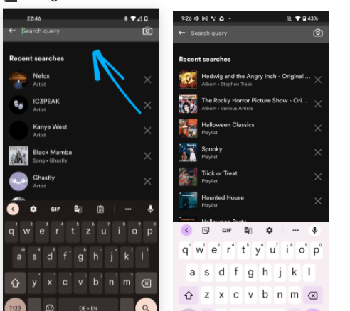
There are certain to be flaws in anything more complicated than a 'hello world' programme, no matter how mature the software is or if we term it stable. If you're running Android 12L on a phone with a notch or punch hole, some of your applications may not appear quite right. A modification in the most recent version of Android is creating a layout fault in some apps, resulting in an offset of background colours, action bars, and maybe other top-of-screen components.
The specific problem appears to be an underestimate of the device insets, which are specified sizes that are unique to each device and advise an app where it may safely draw interface components. It's unclear what causes the glitch, however users of Google's recent OS update appear to imply the issue frequently happens after accessing the keyboard in particular apps, according to a pair of reddit postings. While it is likely to happen with many, Snapchat, Spotify, Flamingo (Twitter client), Talon for Twitter, and Google News were all mentioned.
Our own testing show that this error does not occur on the Pixel 4 XL, but it did occur on the Pixel 6 Pro, and other reports indicate that it also occurs on the Pixel 5. The common thread is that it occurs on devices with a notch or punch hole camera, requiring a bigger status bar and system insets.
There is yet to be proof of what exactly causes the failure. It's possible that the fault is in Android 12L itself, or that it's a side consequence of making a right modification to the OS that exposed a long-standing flaw in some SDK or UI framework used by many developers. If it's the former, it'll be up to Google to rectify it via updates for the impacted phones. Of course, if the latter is the case, we may be in for a lengthy wait while developers update their apps one at a time.
In the meantime, it doesn't appear like there is much that can be done other than force-closing applications. However, the problem is primarily aesthetic, except when it hides buttons, so most of us can probably live with it until Google (or app developers) figure out a solution.


