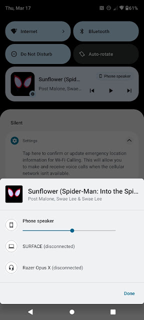
With each each major upgrade, a few aspects of Andorid appear to change: quick settings, notifications, the Settings app, and so on. The media playback controls have also undergone several updates, the most recent of which was in Android 11, and have since been revamped for Android 13.
The album art has been expanded to fill the whole backdrop of the player, and the colours of the buttons have been changed to match the album art rather than the system's dynamic/Material You colours. The media controls on the lockscreen have the same design as the rest of the device.
The media output selector, which can be accessed by clicking the button at the top-right of the media controls, has also been updated in Android 13 DP2. It still lists all possible output devices, exactly like Android 11 and 12, but it's more Material You-friendly and has a new 'Pair new device' button. Instead of being anchored to the side, the popup displays in the centre of the screen.
Runtime permissions for app alerts, enhanced Japanese text wrapping, a new Text Conversion API for languages like Japanese, COLR typefaces, MIDI 2.0, Bluetooth LE Audio, and other enhancements are included in Android 13 Developer Preview 2. For more information and download links for Pixel smartphones, see our main Android 13 Developer Preview 2 coverage.


